Friday, 15 February 2013
Thursday, 14 February 2013
Teacher Assessment
Front Cover:
*The puffs on the
page are too long – they should not be full sentences but punchy
and eye-catching.
*Does your magazine
have a slogan?
*Make your buzz
words stand out more.
*This is the first
edition – how are you promoting it to the audience?
Contents:
*Some of the images
appear to be squashed – make sure that you resize effectively
*Consider taking
more photographs on location rather than just having studio
photographs. All the images on the page are mid-shots with little
thought about mise-en-scene. By going out and taking photographs you
will have a better range.
Article:
*Check all spellings
as Photoshop will not do this for you.
*The main body of
text is too big. Remember that magazine pages are slightly smaller
than A4 so you will need to reduce the size by at least one third.
Also, some of the questions are in gold but others aren’t –
correct this.
*Page numbers are
needed.
Peer Assessment
Peer Assessment 1:
Front Cover:
- Cover: Good use of puffs, however, the text should be integrated with the text more. Maybe, there could be more puffs around the main artist on the front cover.
- Super Impose: You could super impose the main person in front of the title, to make her stand out and bring more attention to the magazine.
- Graphic Image: The graphic image and the text could be a little bigger, to entice people to purchase your magazine.
- Title Block: You could try smoothing out the title block so that it looks like it fits in with the main image and puffs on your front cover.
Contents:
- Colour of headers: I do like how the colours of your headers are the same as the colours on your title block, however, maybe the colours for your headers could be darker, to make them stand out against the light background of your page.
- Secondary images: Perhaps you could have signatures to go with your images; so that it doesn’t look too plain, like you did with ‘Tiana Taylor’.
Article:
- Article Pages: The layout of the magazine looks very professional, which really helps me gain an idea of who your target audience is. However, some of the questions you asked in your magazine article haven’t been highlighted so it looks like the person being interviewed is asking themselves the questions.
- Spelling errors: You made a few spelling mistakes, don’t worry it’s only a few! ‘Rendering’ and also, in a few sentences, you typed ‘I’ in lowercase instead of capitalising it.
- Quotes: Perhaps you could have one or two more quotes on the images, so that you have more integration of text with the images, otherwise it is a very good article and throughout the magazine, the language is very formal.
Peer Assessment 2:
Front Cover:
Cover: To improve
you can put the price down by the barcode make the buzz word
Exclusive more Exclusive than it is by maybe making it bigger and
bolder possible a different font or have a different background. The
words ‘Exclusive interview with Jazmine Sullivan’ is smaller than
the other puffs on the front cover so maybe you should make it bigger
and then make the artist name within the sentence big instead of
having her name twice. Make the bar code smaller and maybe move is to
the other side of the page and move the graphic image to wear the bar
code is but make it bigger.
Contents:
Contents: the
picture of ‘Jazmine’ at the top of the page looks squashed maybe
retake or resize picture so it’s not so squashed. I like the fact
that you put a picture of the chief Editor and a comment from her to
the readers.
Article:
Article Pages: in
the first bit of your article you say that her ‘hair is worn loose
in her signature curls’ this means that her fans may be expecting
her hair to be loose and in curls but in the pictures her hair is in
a bun so you might need to change that. In the first question there
is a mistake as it says ‘what is the name of you first album and
why did you named it this?’. Make all the questions the same
colour and not the same colour as the quot. Start a new line after
the question so it is clear when the artist is speaking. The quote’
Heart Rendring intense and powerful’ the word Rendring is
spelt incorrect it is spelt Rendering. The end sentence you
have put ‘she’s a gifted person who’s is down to earth’ there
is a mistake in this sentence as it doesn’t make sense. The last
sentence ‘There hasn’t been a confirmation date yet.’ I don’t
think that you really need this sentence. I like the fact that at
the end you put the interviewers’ name and photographers name at
the end of the article.
Self-Assessment
Front Cover: What I should improve on my front cover. The puffs on my front cover I should add more text so that it looks more integrated, so I should add puffs around my central image, so that it could balance out my front cover, also the buzz word “exclusive” I should make it more effective by making it bigger and bolder or maybe a different font so that it can stand out because it’s smaller than the other puffs. I will move my price near the barcode and make the barcode smaller. I will make my graphic image bigger so that it will attract my audience to buy my magazine. I will also try to smooth out my title so that it fits in with the main image and puffs on my front cover. This is what I will be doing to improve my front cover.
Content’s page: On my contents page I should improve on is focusing on resizing my main artist picture because she currently looks “squashed” so I should therefore resize the image. I will also improve on the colour of my title block; I should make the colours darker so that my title block will stand out. I will also add in signatures from the artist on their image so that it does not look too plain. This is what I will be doing to improve my contents page.
Saturday, 2 February 2013
Reason of selecting images
Front Cover
The photograph that I picked for my Front Cover. The reason why I choose this particular image is because it matches with my front cover layout and also I prefer this kind of shot than mid-shot or close up shot to be my front cover. Also because my model is positioned near to the right side whereas on my mockup draft I want my puffs to be laid on the left side and so since the model is positioned near the right side it will balance out my front cover, so my puffs would be on the left side and the model is on the right side.
Contents
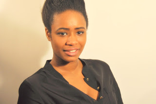
The reason why I picked this image is because for my contents layout I wanted close up or mid-shot images of artist to show the expression of their face. Also that all the contents images can fit within the small section.
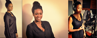
Article All these images placed below I choose them for the Article pages, the reason why I picked these images are because the music studio images shows her singing expression showing the audience that she works hard, she's independent & a true black musician who believes in herself and also that she's devoted in her music career. The studio photo shoot shows her happy side and showing the readers that they should be happy on who they actually are and not to pretend to be someone else, showing the women power.
The photograph that I picked for my Front Cover. The reason why I choose this particular image is because it matches with my front cover layout and also I prefer this kind of shot than mid-shot or close up shot to be my front cover. Also because my model is positioned near to the right side whereas on my mockup draft I want my puffs to be laid on the left side and so since the model is positioned near the right side it will balance out my front cover, so my puffs would be on the left side and the model is on the right side.
The reason why I picked this image is because for my contents layout I wanted close up or mid-shot images of artist to show the expression of their face. Also that all the contents images can fit within the small section.
Friday, 1 February 2013
Editing my images
Second article page edits
Before
After
Edits

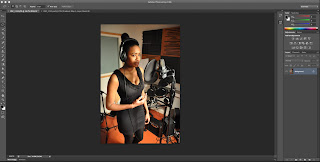
The cropping tool is the last icon, this is to select the only area I want to focus on. The Lasso tool at the top is to help me circle the area where I want to focus on.
The menu which shows the levels, curves & gradient map tool. Left is the Level tool where I can adjust the contrast. Bottom is the gradient map tool which gives filter into the image and I can adjust the filtering lastly the curve tool which is on the right, this is where I can adjust the contrast, highlights and shadows of the image, creating the s-curve.
Front, Contents & first Article edits
BeforeAfter
The edits I used for my Front Cover, Contents & front article image are the same edits. The first edit I used was the sharpen tool, this is because my original image did not stand out, the sharpen tool makes it stand out and makes the pixels brighter. After I sharpen my image i then go on the contrast and brightness tool to adjust the contrast and brightness, to give my image an uplifting colour to make it stand out. The edits I used was simple, this is because i did not want to add anything else but give the image brightness.
Subscribe to:
Comments (Atom)


