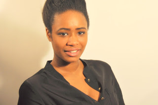
The photograph that I picked for my Front Cover. The reason why I choose this particular image is because it matches with my front cover layout and also I prefer this kind of shot than mid-shot or close up shot to be my front cover. Also because my model is positioned near to the right side whereas on my mockup draft I want my puffs to be laid on the left side and so since the model is positioned near the right side it will balance out my front cover, so my puffs would be on the left side and the model is on the right side.
The reason why I picked this image is because for my contents layout I wanted close up or mid-shot images of artist to show the expression of their face. Also that all the contents images can fit within the small section.


No comments:
Post a Comment