Editing my images
Second article page edits
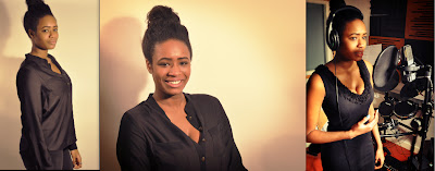
Before
After
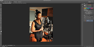
The edits that I used for my second page article images. On my second article page I used the same edit to all the images on the page. I used photoshop to edit my images, the first thing I did was to crop my image because there are parts on the image I did not really need. After I cropped out my image I then sharpen my image, I sharpen my image because the sharpen tool makes the image pop out more than the original image it make the edges in the picture appear more defined by darkening the darker pixels and brightening the brighter pixels. This creates a crisp edge between light and dark portions of the image, giving it more contrast. This is why I used the sharpen tool to make the image pop out more. When I finish sharpening my image I then move on to using the Lasso tool which create a selection on where I want to work/focus on, I select around my model, after I finish drawing around the model I then click on inverse which will invert selection, because I used the lasso tool around my model which is positioned in the middle, the inverse will make that only circle i've drawn around is not to be selected but everything else is. I then click on levels, I used this because this tool can move and stretch brightness level, it's three main components are black point slider, mid-tone slider and white point slider, using this gives the image a range of edit, it can give lower contrast, higher contrast, stronger highlights & no pixel at full brightness. I wanted my image to have a higher contrast so then I moved the histogram image arrow towards the white point slider. I then flatten the image out, after I click on the curves tool which is similar to the level tool. However the curve tool there are two main areas which are output tone and the input tone, the input receive less contrast, whereas the output tones gets more contrast, I made sure that it looked like an s-curve, s-curve adds more contrast to the mid-tones into the shadows and highlights. After I finish using the curves tool I then flatten the image out. I then use the Gradient map tool which gives filters into the image, I choose the violent and orange colour, the reason why I picked this is because I wanted it to give the vintage colour look, I then click on soft lighting this is where i can adjust how much of the colour I want on the image, to get the perfect vintage colour. This is the last tool I used to edit my images.

Edits
 The cropping tool is the last icon, this is to select the only area I want to focus on. The Lasso tool at the top is to help me circle the area where I want to focus on.
The menu which shows the levels, curves & gradient map tool. Left is the Level tool where I can adjust the contrast. Bottom is the gradient map tool which gives filter into the image and I can adjust the filtering lastly the curve tool which is on the right, this is where I can adjust the contrast, highlights and shadows of the image, creating the s-curve.
This is the Sharpen tool, this tool is to make my image stand out by adjusting the amount and radus.
Front, Contents & first Article edits
Before
After
The edits I used for my Front Cover, Contents & front article image are the same edits. The first edit I used was the sharpen tool, this is because my original image did not stand out, the sharpen tool makes it stand out and makes the pixels brighter. After I sharpen my image i then go on the contrast and brightness tool to adjust the contrast and brightness, to give my image an uplifting colour to make it stand out. The edits I used was simple, this is because i did not want to add anything else but give the image brightness.


No comments:
Post a Comment